

Before

User Testing
Customer Research
Microsoft Icon design system alignment
Alignment with new Microsoft edge icon
CELA trademark
Bing Rebrand
After

Goal
Explore expanding the dimensionality of the marks to better match both the Edge and Office shapes.
Amplify the three-color gradients to add more depth and vibrance to the marks.
Assay unexplored pockets on the spectrum from the folded look of the Office icon and the carved look of the Edge Icon
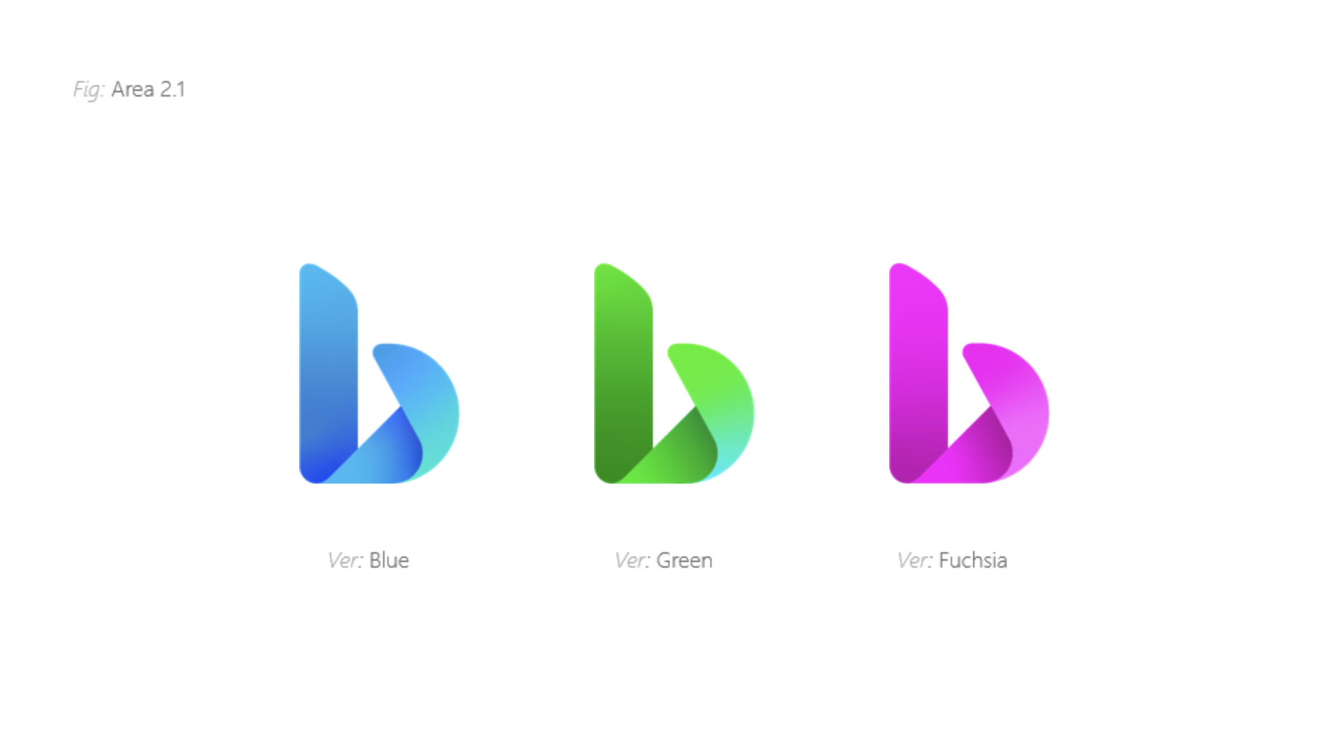
Introduce a new COLOR option…

Spectrum


Exploration


In 2019, I led my first major project at Microsoft—Bing’s 10th-anniversary brand refresh. As the sole designer, I drove the initiative to align Bing’s visual identity with other Microsoft products like Edge and Office. I conducted extensive design explorations and partnered closely with the research team to develop and finalize a new Bing logo that reinforced Microsoft’s cohesive product ecosystem. The final design, selected through multiple rounds of user research, is now the official logo in use.
Role : Art Director, Designer, 2019
Final Logo

Exploration
