
Fluent Monoline
Where we were
How can we bring more realism and expressiveness into Maximal icon?


Maximal Icon
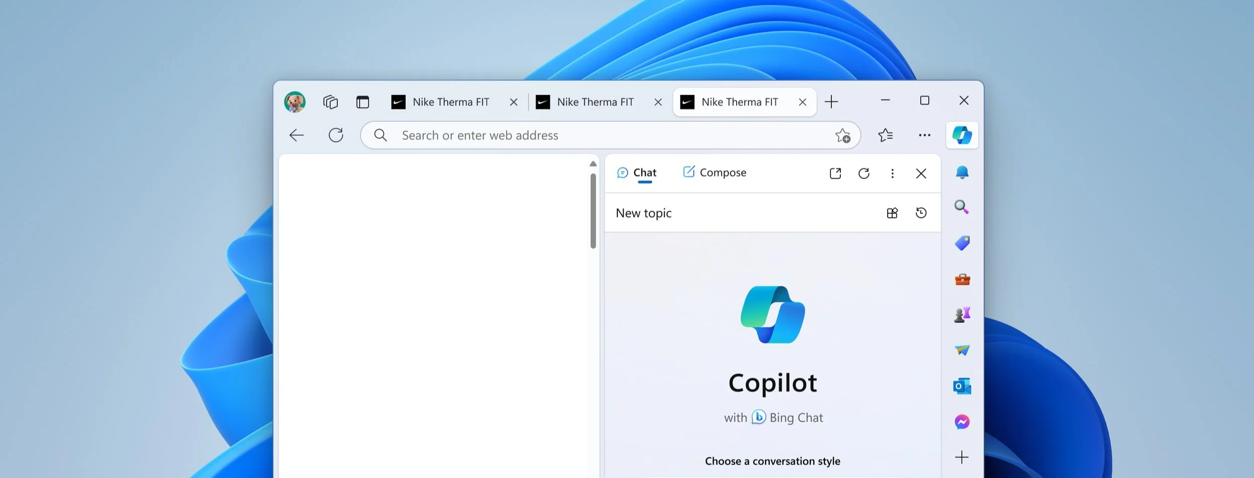
To enhance our web product’s user experience, I developed a visual style for color icons based on the Fluent icons (monoline) with a new system. This system differentiates the function of icons: utility (monoline) versus discovery-focused entry points (color icons). This improvement enhances navigation within the Edge sidebar, with each icon entry point representing a distinct Edge feature, bringing more expression and engagement. I also created the system to ensure scalability and established guidelines to maintain consistency with other Microsoft app icons and future applications

Goal
Role : Creative Director, Designer
Expression Spectrum

Other explorations

Detail/Dimensionality Exploration

