


Problem
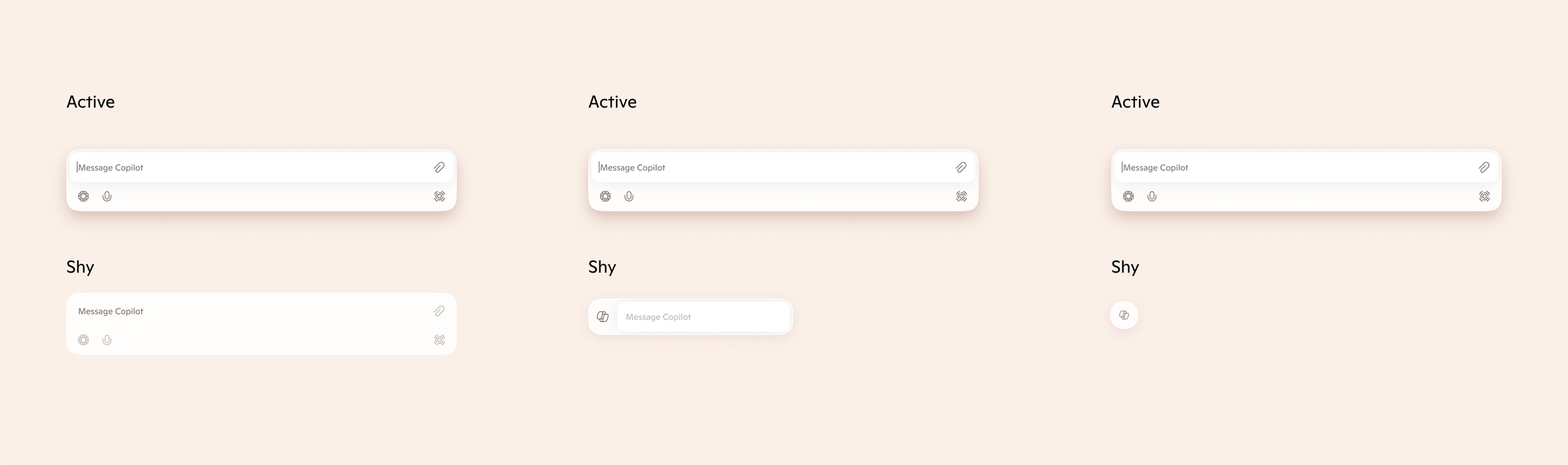
As I examined the use of composers across our ecosystem, I identified scenarios where multiple composers appear simultaneously, leading to visual redundancy and user distraction. To address this, I explored strategies to streamline the UI and help users focus on their active Copilot interaction. One proposed solution introduces a new composer “shy state”—a subtle, minimized version for composers that are present on screen but not in focus. This approach helps establish a clearer visual hierarchy, reduces cognitive load, and creates a more cohesive experience across multiple windows and Copilot instances.

So many Composers!!!
Exploration
Copilot Composer
The current ecosystem includes multiple Copilot experiences—such as the Copilot app, CMC, Copilot for M365, Copilot Search, mobile apps, and Windows Copilot—all with differing visuals and interaction patterns. This fragmentation creates confusion and inconsistency for users. Our goal is to align these experiences under a unified design system, reducing duplication and improving clarity. As part of this effort, we’re also refreshing the composer design to enhance usability and deliver a more modern, cohesive experience.
My focus was on rationalizing the composer design across products by developing a shared UX framework that demonstrates how the composer can function consistently across different Copilot surfaces. I also led the customization of the Copilot Search experience within Bing to align with this unified vision. Additionally, I explored strategies to manage multiple composers appearing simultaneously—focusing on how to maintain clarity and prioritize user attention without overwhelming the experience.
Current
After